Plus AI Feature
Stop fighting with manual formatting and let the model handle the layout. These Chart & Table Prompt Ideas for Nano Banana help you generate structured visuals—like pricing tiers, financial data, or feature comparisons—that look professionally designed. Since Nano Banana Pro excels at rendering text, you get accurate labels and headers right inside your presentation without worrying about typos.
24 prompts

Create a slide showing email open rates, click rates, and conversion by campaign. Design in an email marketing analytics style with envelope and click icons, performance bar charts in brand colors, benchmark comparison lines, A/B test indicators, inbox preview mockups, Mailchimp-inspired friendly aesthetic, and data-clear typography.

Design a pricing table slide comparing Basic, Pro, and Enterprise subscription tiers. Use a SaaS pricing page style with three vertical pricing cards, recommended tier highlighted with ribbon badge, feature checkmark lists, price in large bold numbers, CTA button styling, gradient header bars, and clean conversion-optimized typography.

Design a semester overview slide showing weekly topics, assignments, and grading. Use an academic syllabus style with weekly topic timeline, assignment due date markers, grade weight breakdown pie chart, required reading list, professor contact info, university colors and crest, collegiate aesthetic, and scholarly academic typography.

Create a slide presenting clinical trial results with statistical outcomes. Use a scientific publication style with results table showing p-values and confidence intervals, Kaplan-Meier survival curve, forest plot graphic, statistical significance stars, peer-review quality formatting, medical journal aesthetic, and precise scientific typography.
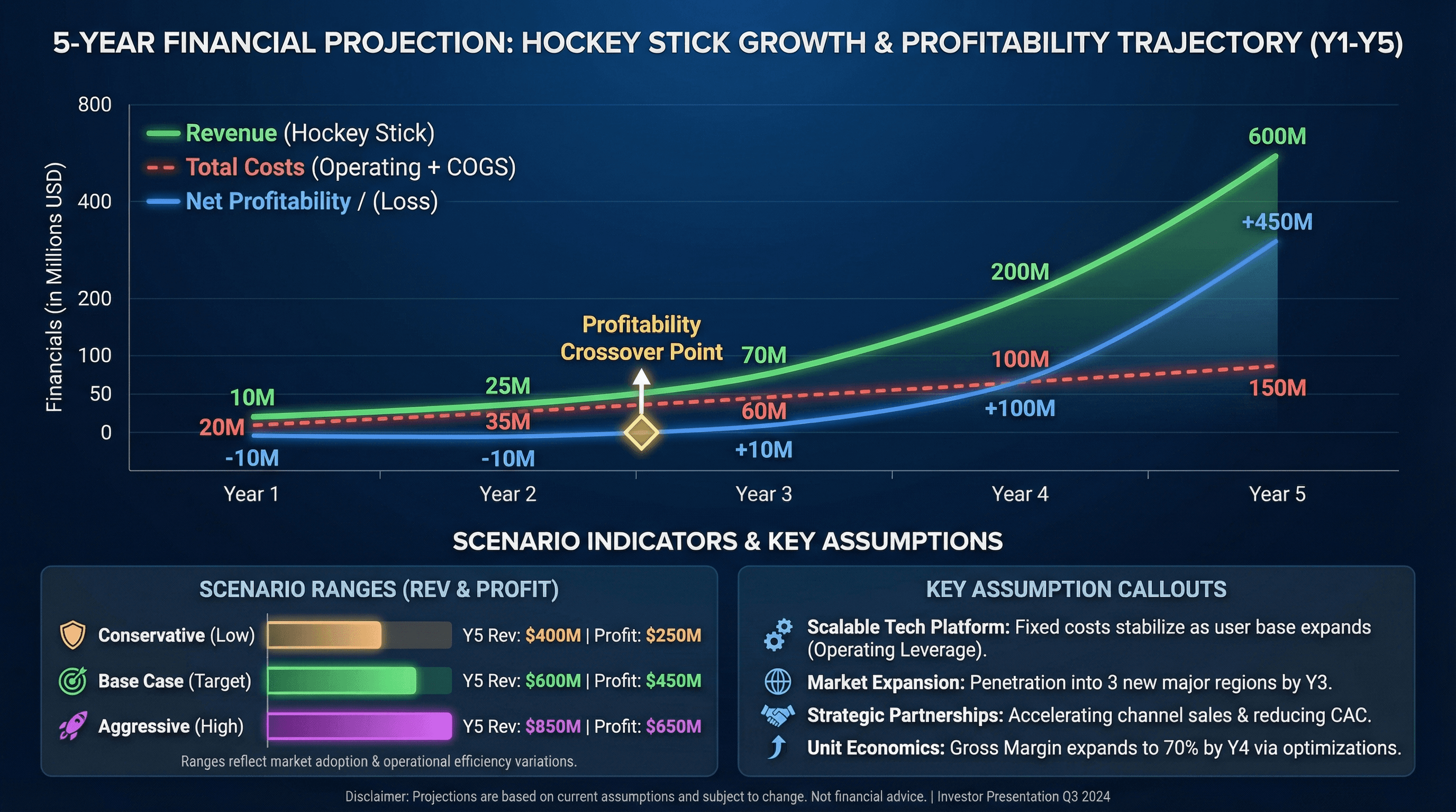
Create a 5-year financial projection slide with revenue, costs, and profitability. Design in a hockey stick projection style with multi-line chart showing revenue growth, profitability crossover point highlighted, key assumption callouts, conservative/base/aggressive scenario indicators, investor-friendly formatting, and professional financial typography.
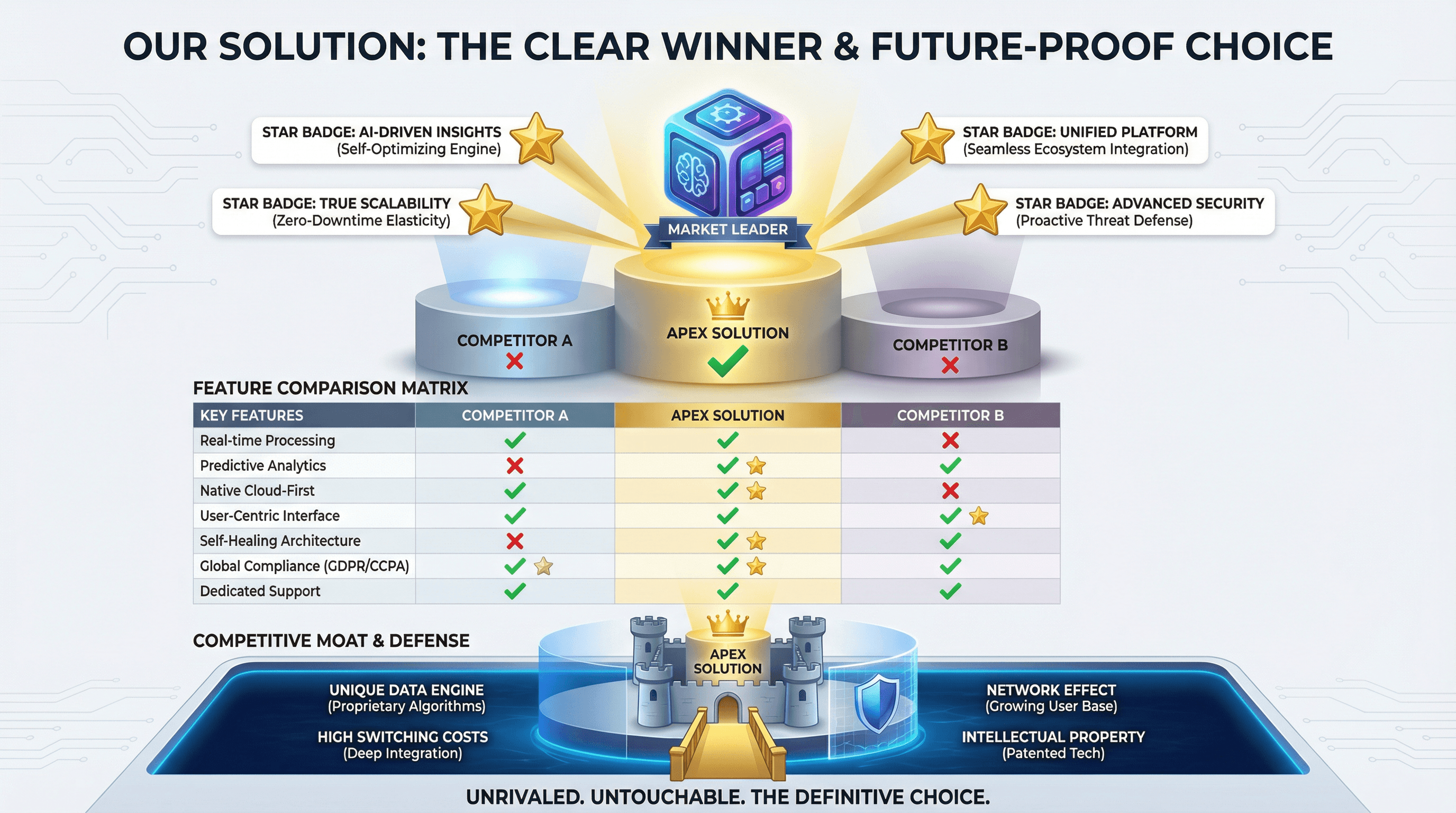
Create a slide comparing your solution to competitors with feature matrix. Use a winner's podium style with your product on top center position, competitor comparison table with green checkmarks vs red X marks, unique differentiator callouts with star badges, competitive moat visualization, and confident differentiation typography.

Design a slide showcasing growth metrics, user numbers, and milestones achieved. Use an up-and-to-the-right style with hockey stick growth chart as hero visual, large milestone numbers with achievement dates, customer logo parade, user count with growth percentage, celebratory confetti accents, momentum-building gradient, and exciting traction typography.
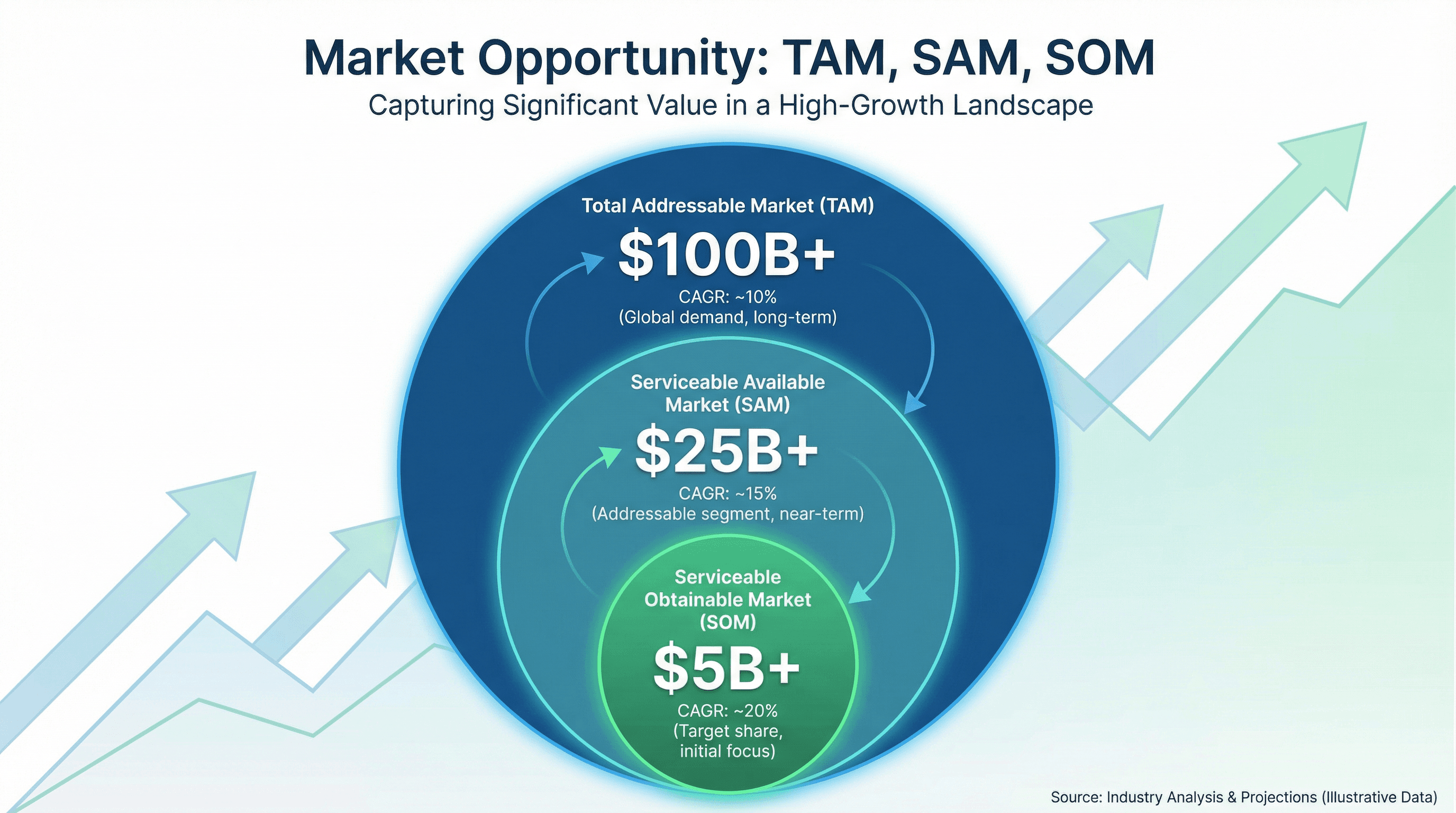
Design a slide showing Total Addressable Market, Serviceable Market, and Target Market. Use a market opportunity style with three concentric circles (largest TAM to smallest SOM), dollar amounts in billions, market growth percentages, upward trending background graphic, investor-friendly blue and green colors, and compelling market sizing typography.

Design a slide showing budget allocation across departments with pie/donut chart. Use a financial planning style with colorful donut chart segments, percentage and dollar labels, department icons, comparison to prior year indicators, budget variance callouts, CFO presentation aesthetic, and clear financial reporting typography.

Create a spider/radar chart slide showing digital maturity across 6 dimensions. Use a diagnostic assessment style with hexagonal radar chart, current state vs target state overlay lines, dimension labels around perimeter, maturity level scale (1-5), gap highlighting, technology audit aesthetic, and analytical assessment typography.

Create a slide comparing client KPIs against industry benchmarks. Design in a competitive analysis style with bar chart comparing client (highlighted) vs industry average vs best-in-class, gap indicators, performance medals for leaders, benchmark source citations, professional blue and gray palette, and authoritative research typography.

Design a slide presenting cost-benefit analysis for office relocation decision. Use a financial decision style with two-column comparison (costs in red, benefits in green), stacked bar chart showing totals, NPV calculation box, balance scale graphic, currency symbols, spreadsheet-inspired grid lines, and clear financial analysis typography.
How to use these Chart & Table Prompt Ideas for Nano Banana prompts
These prompts are designed to help you bypass the tedious process of building complex charts and tables from scratch in your slide software. Browse through the examples to find a layout that fits your data structure, then copy the prompt and swap in your specific labels and numbers. It is a quick way to get structured, presentation-ready visuals without wrestling with alignment tools or grid settings.
Be explicit about your text labels. Nano Banana Pro is incredibly good at rendering text, so you should tell it exactly what to write on axis labels, column headers, and data points. If you want a column labeled Q4 Growth, put that in the prompt. The model will place the text accurately within the image.
Define the layout structure clearly. For tables, specify the number of rows and columns you need. For charts, describe whether you want a bar chart, pie chart, or line graph, and mention if you need a legend included. The more specific you are about the geometry of the slide, the better the output will be.
Don't forget to describe the styling. If your presentation uses a specific color palette, mention those hex codes or color names. You can also request specific styles like clean corporate, hand-drawn sketch, or dark mode to match your deck's vibe. This ensures the generated image feels like a native part of your presentation rather than a pasted screenshot.
Pricing tables are a perfect fit for this category. You can generate a three-column pricing slide with headers like Basic, Pro, and Enterprise, complete with price tags and feature lists. Since the AI handles text rendering so well, the prices and feature names will be crisp and legible, saving you from manually formatting text boxes.
Comparison matrices also work beautifully. If you need to show how your product stacks up against competitors, ask for a comparison chart with checkmarks and feature names. The AI handles the grid alignment and text placement, so you get a finished asset that highlights your competitive advantage instantly.
Control the typography hierarchy in your prompt. You can instruct Nano Banana to make the chart title large and bold sans-serif, while keeping the data labels small and gray. This ensures your key message stands out immediately and gives the slide a professional polish.
Work directly in Google Slides and PowerPoint — no need to learn a new tool
Never start from scratch again, just tell us what kind of presentation you want to make.
Add, remix, and rewrite your slides to fine-tune your presentation.
If you have complex data, try describing the visual trend rather than just the numbers. For example, ask for a line chart that shows a steady increase over time with a sharp spike at the end labeled Record High. This helps the AI generate a visual curve that matches the narrative you are trying to tell.