Plus AI Feature
Stop fighting with manual formatting and let the model handle the layout. These Chart & Table Prompt Ideas for Nano Banana help you generate structured visuals—like pricing tiers, financial data, or feature comparisons—that look professionally designed. Since Nano Banana Pro excels at rendering text, you get accurate labels and headers right inside your presentation without worrying about typos.
24 prompts

Create a slide analyzing recent sales wins and losses with reasons and trends. Use a sports scoreboard style with wins in green column, losses in red column, reason category breakdowns, trend arrows, competitive battle imagery, victory trophy and learning lightbulb icons, scoreboard number display, and competitive sports typography.

Create a slide showing churn rates, retention strategies, and customer lifetime value. Design in a customer success style with retention curve graph, cohort analysis grid, CLV calculation breakdown, loyalty program icons, heart and handshake graphics, warm retention-focused colors (greens and blues), and relationship-building typography.

Design a slide showing marketing ROI calculation with investment and returns breakdown. Use a financial results style with calculator graphic, large ROI percentage in green, investment vs return comparison bars, money stack illustrations, upward trending arrow, profit highlight boxes, and impactful financial typography with dollar signs.

Create a market positioning slide showing competitors on a 2x2 matrix. Design in a strategic consulting style with elegant navy and gold color scheme, competitor logos in positioned circles, quadrant labels in sophisticated serif fonts, subtle grid lines, premium matte background texture, and McKinsey-inspired executive presentation aesthetic.

Design a funnel visualization slide showing lead to customer conversion rates. Use a bold conversion-focused style with wide-to-narrow funnel graphic in gradient orange to deep red, percentage labels at each stage, falling lead icons, dollar sign accents, dynamic diagonal energy lines, and impactful sales-focused typography with large numbers.

Create a slide presenting A/B test results with statistical significance and conversion metrics. Use a data science experiment style with split comparison layout (Control A vs Variant B), bar charts with confidence intervals, p-value callouts, statistical formula accents, lab experiment beaker imagery, and precise scientific Helvetica typography.

Design a slide comparing GDPR, CCPA, and HIPAA data privacy requirements. Use a legal compliance aesthetic with official document styling, comparison table with checkmarks and X marks, flag icons for jurisdictions, gavel and scale of justice graphics, formal navy and gold colors, and authoritative Times New Roman serif typography.

Create a comparison slide evaluating React vs Vue vs Angular for frontend development. Design in a versus battle style with each framework in its brand colors (React blue, Vue green, Angular red), side-by-side comparison cards, radar chart showing strengths, VS lightning bolt graphics, competitive sports aesthetic, and bold header typography.

Create a quick reference slide showing normal vital sign ranges across age groups. Design in a clinical monitor aesthetic mimicking hospital bedside displays with black background, glowing green and amber LED-style numbers, heart rate waveform graphics, digital readout fonts, rounded monitor bezels, and organized grid layout resembling medical equipment interfaces.

Create a clinical reference slide showing pediatric medication dosages by weight for common antibiotics. Design in a sterile medical chart style with crisp white background, hospital blue headers, precise grid lines, pill and syringe icons in flat design, color-coded dosage ranges (green for safe, yellow for caution), and clear Helvetica typography with high contrast.
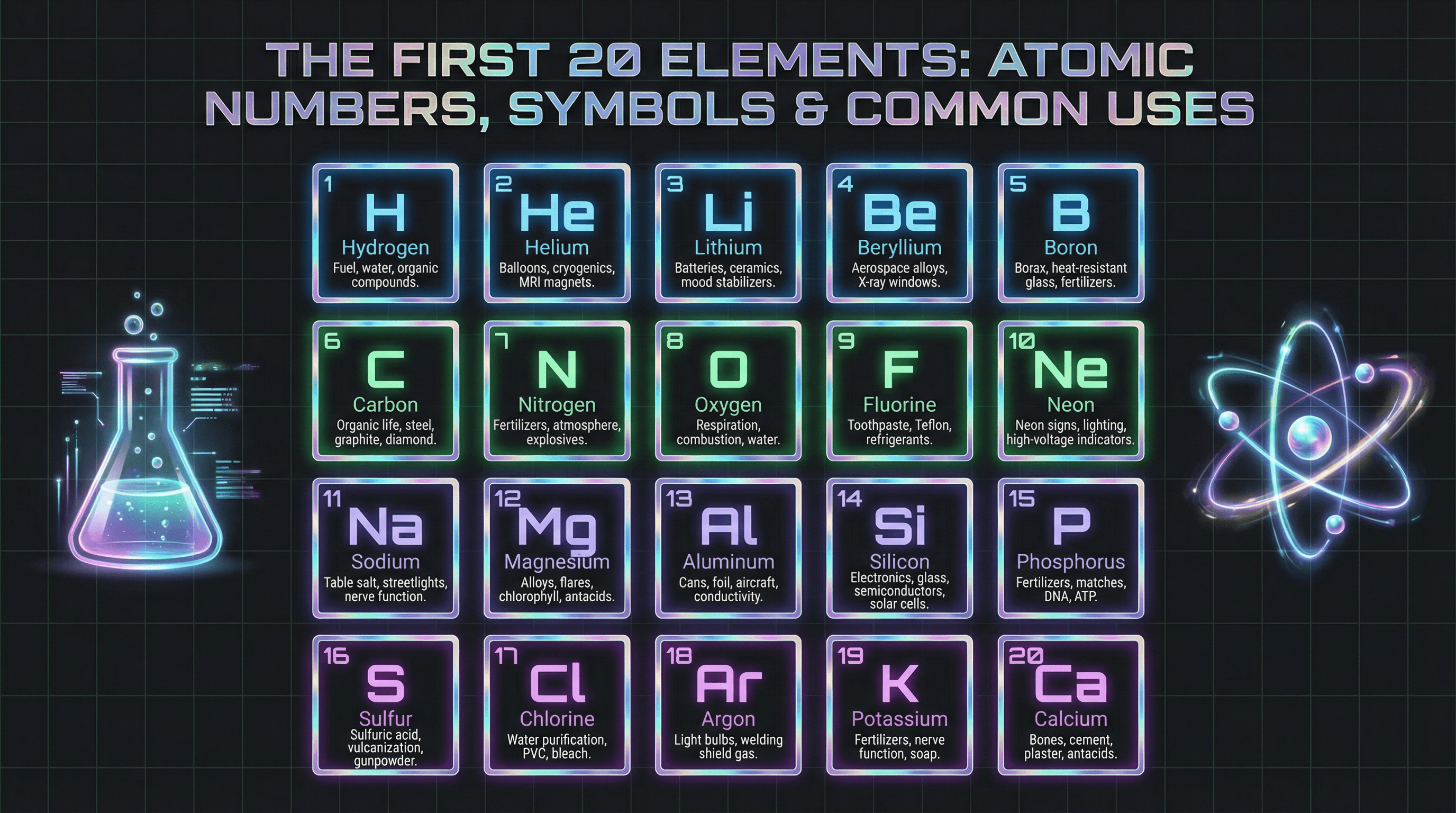
Create an informative slide highlighting the first 20 elements with atomic numbers, symbols, and common uses. Design in a neon laboratory style with dark charcoal background, glowing element tiles in electric blue, green, and purple gradients, holographic metallic accents, futuristic sans-serif typography, animated beaker and atom illustrations, and subtle grid patterns.

Create a colorful slide with multiplication tables 1-12 in a grid format for 3rd graders. Design in a cheerful rainbow gradient style with each row in a different pastel color, chunky rounded sans-serif numbers, cute animal mascots (owls, foxes) holding number cards, confetti and star decorations, and a chalkboard-inspired frame with hand-drawn chalk texture elements.
How to use these Chart & Table Prompt Ideas for Nano Banana prompts
These prompts are designed to help you bypass the tedious process of building complex charts and tables from scratch in your slide software. Browse through the examples to find a layout that fits your data structure, then copy the prompt and swap in your specific labels and numbers. It is a quick way to get structured, presentation-ready visuals without wrestling with alignment tools or grid settings.
Be explicit about your text labels. Nano Banana Pro is incredibly good at rendering text, so you should tell it exactly what to write on axis labels, column headers, and data points. If you want a column labeled Q4 Growth, put that in the prompt. The model will place the text accurately within the image.
Define the layout structure clearly. For tables, specify the number of rows and columns you need. For charts, describe whether you want a bar chart, pie chart, or line graph, and mention if you need a legend included. The more specific you are about the geometry of the slide, the better the output will be.
Don't forget to describe the styling. If your presentation uses a specific color palette, mention those hex codes or color names. You can also request specific styles like clean corporate, hand-drawn sketch, or dark mode to match your deck's vibe. This ensures the generated image feels like a native part of your presentation rather than a pasted screenshot.
Pricing tables are a perfect fit for this category. You can generate a three-column pricing slide with headers like Basic, Pro, and Enterprise, complete with price tags and feature lists. Since the AI handles text rendering so well, the prices and feature names will be crisp and legible, saving you from manually formatting text boxes.
Comparison matrices also work beautifully. If you need to show how your product stacks up against competitors, ask for a comparison chart with checkmarks and feature names. The AI handles the grid alignment and text placement, so you get a finished asset that highlights your competitive advantage instantly.
Control the typography hierarchy in your prompt. You can instruct Nano Banana to make the chart title large and bold sans-serif, while keeping the data labels small and gray. This ensures your key message stands out immediately and gives the slide a professional polish.
Work directly in Google Slides and PowerPoint — no need to learn a new tool
Never start from scratch again, just tell us what kind of presentation you want to make.
Add, remix, and rewrite your slides to fine-tune your presentation.
If you have complex data, try describing the visual trend rather than just the numbers. For example, ask for a line chart that shows a steady increase over time with a sharp spike at the end labeled Record High. This helps the AI generate a visual curve that matches the narrative you are trying to tell.