Plus AI Feature
Stuck building a strategy deck? Use these Consulting & Business Prompt Ideas for Nano Banana to generate professional frameworks, org charts, and analysis slides that actually look good. Because Nano Banana Pro handles text rendering perfectly, you can create complex diagrams with accurate labels and titles directly in your presentation. It is a lifesaver for executive summaries or client pitches where details matter.
27 prompts

Design a slide presenting the target operating model with capabilities and governance. Use an organizational design style with layered model graphic (strategy, capabilities, processes, technology), interconnecting gears showing how elements work together, role boxes, governance arrows, blueprint aesthetic, and architectural organization typography.

Create a post-merger integration timeline showing Day 1 to 12-month milestones. Use an M&A integration style with horizontal timeline, workstream swimlanes (IT, HR, Finance, Operations), critical path highlighting, synergy capture markers, two company logos merging graphic, deal-making navy and gold colors, and corporate transaction typography.

Design a slide showing primary and support activities in Porter's value chain. Use a strategic framework style with horizontal arrow showing primary activities flow, support activities stacked above, activity boxes with icons, margin indicator on right, interconnecting dotted lines, academic business school aesthetic, and strategic management typography.

Create an executive summary slide for a $5M technology investment business case. Use an investment proposal style with key metrics in large callout boxes (NPV, IRR, Payback Period), investment breakdown pie chart, benefit bullets, risk summary, approval recommendation badge, formal boardroom aesthetic, and persuasive financial typography.
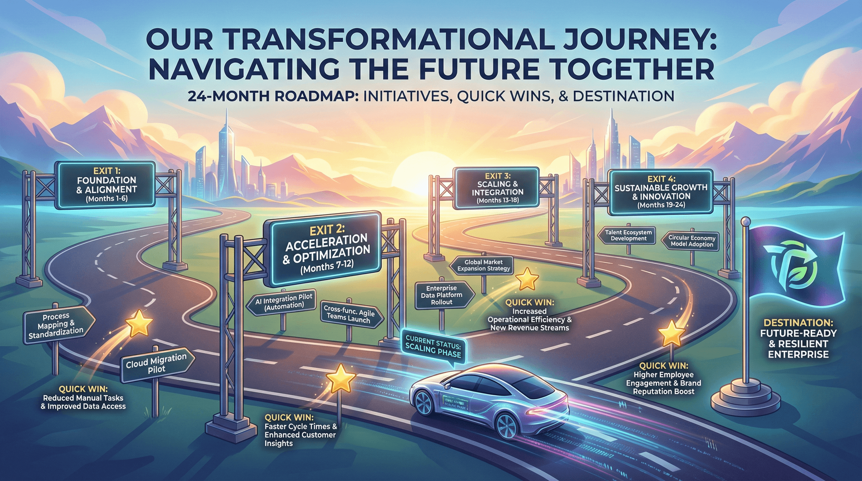
Design a 24-month transformation roadmap with key initiatives and quick wins. Use a journey metaphor style with horizontal road graphic, phase gates as highway exits, initiative signposts, quick win star markers, destination flag, progress vehicle icon, aspirational horizon imagery, and inspirational transformation typography.

Create a Gantt chart slide showing project phases, tasks, and milestones. Use a project management style with horizontal timeline bars in different colors per workstream, diamond milestone markers, dependency arrows, resource assignment initials, today line indicator, MS Project-inspired aesthetic, and precise project planning typography.

Design a slide presenting top 5 strategic recommendations with expected impact. Use a board presentation style with numbered recommendation cards, impact indicators (high/medium/low badges), implementation timeline icons, priority ranking, executive summary aesthetic, premium navy background with white text, and commanding C-suite typography.

Create a slide comparing client KPIs against industry benchmarks. Design in a competitive analysis style with bar chart comparing client (highlighted) vs industry average vs best-in-class, gap indicators, performance medals for leaders, benchmark source citations, professional blue and gray palette, and authoritative research typography.

Design a slide mapping stakeholders by influence and interest in a 2x2 matrix. Use a political strategy style with quadrant grid, stakeholder names in positioned bubbles sized by importance, quadrant labels (Manage Closely, Keep Satisfied, Keep Informed, Monitor), connection lines showing relationships, diplomatic navy and gold colors, and strategic typography.

Create a slide explaining Kotter's 8-step change management model. Use an organizational transformation style with ascending staircase graphic representing 8 steps, step numbers in circles, brief descriptions at each level, people silhouettes climbing stairs, sunrise at top representing successful change, warm encouraging colors, and leadership typography.

Design a slide presenting cost-benefit analysis for office relocation decision. Use a financial decision style with two-column comparison (costs in red, benefits in green), stacked bar chart showing totals, NPV calculation box, balance scale graphic, currency symbols, spreadsheet-inspired grid lines, and clear financial analysis typography.

Create a slide with a risk matrix showing probability vs impact for project risks. Use a risk management style with 5x5 heat map grid (green to yellow to red gradient), plotted risk items as numbered circles, risk category legend, warning triangle icons, corporate governance colors (navy, gray, red), and serious risk management typography.
How to use these Consulting & Business Prompt Ideas for Nano Banana prompts
These prompts are designed to help you quickly generate professional visual assets for strategy decks, client presentations, and business analyses. You can use them as a direct template for your slides or as inspiration to visualize complex frameworks. Browse through the examples to see how we structure requests for diagrams, charts, and organizational models, then swap in your specific industry terms or client data to get a custom result.
Be specific about the framework you want to visualize. Nano Banana understands standard business concepts, so using specific terminology helps. Instead of asking for a generic business diagram, ask for a SWOT analysis, a flywheel model, or a value chain diagram. Naming the specific framework gives the AI a clear structural blueprint to follow, which results in a much more usable image for your slide.
Take full advantage of Nano Banana Pro's text rendering capabilities. Unlike older image generators that struggle with spelling, this model is exceptional at placing accurate text inside images. You should explicitly list the labels, titles, and axis descriptions you want to appear in the diagram. For example, if you are generating a roadmap, include instructions like label the phases Q1 Planning, Q2 Execution, and Q3 Review to save yourself from having to add text boxes manually later.
Define the aesthetic to match a corporate environment. Consulting presentations usually require a clean, high-end look. To avoid getting images that look too artistic or moody, use style descriptors like flat vector design, minimalist corporate style, or white background with navy blue accents. This ensures the output integrates seamlessy into a professional PowerPoint or Google Slides deck.
Visualizing abstract processes is a huge time-saver here. If you are trying to explain a complex workflow or a change management strategy, you can generate a step-by-step chevron process or a circular loop diagram. Because you can include the actual step names in the prompt, the result is a ready-to-use visual that replaces a boring bulleted list.
Creating stakeholder maps and organizational charts is another perfect scenario. You can describe a hierarchy or a matrix structure and have Nano Banana populate the boxes with role titles like CEO, VP of Sales, or Operations Lead. It handles the layout and the typography at the same time, giving you a polished org design without the frustration of manually aligning shapes and connectors.
Work directly in Google Slides and PowerPoint — no need to learn a new tool
Never start from scratch again, just tell us what kind of presentation you want to make.
Add, remix, and rewrite your slides to fine-tune your presentation.
You can dictate the exact layout composition to fit your slide content. If you know you need space on the left side of the slide for your main bullet points, tell Nano Banana to place the diagram on the right side. The model follows layout instructions closely, allowing you to compose the image specifically for a split-screen slide design.
Try describing your brand's color palette in the prompt. Since Nano Banana adheres strictly to color instructions, you can list your specific brand colors (like slate grey, teal, and coral) to ensure the generated charts and diagrams match the rest of your presentation template instantly.